When Your CRM Has the Data But Nobody Can See It
The data was there. Every deal stage, every call logged, every task completed — it was all sitting inside their CRM. The problem was that nobody could actually see it.
Every month, the executive committee would gather for their operations meeting. And every month, someone would pull up a spreadsheet. Not a dashboard, not a report from the CRM — a manually assembled Excel file that someone on the team had spent hours building. Colour-coded cells. Merged headers. Conditional formatting that broke if you looked at it wrong. Half the meeting was spent squinting at numbers and asking "wait, is that column current month or last month?"
The CRM had everything they needed. They just had no way to get it out in a form that made sense to anyone who wasn't the person who built the spreadsheet.
The Spreadsheet Tax
Here's the thing about spreadsheets as reporting tools: they work right up until they don't. One person builds it, understands the logic, maintains the formulas. Then that person goes on leave or gets promoted, and suddenly nobody knows why column G is referencing a hidden sheet called "OLD_DO_NOT_DELETE."
This client had multiple teams — sales, brokerage, credit, acquisitions — each with their own reporting needs. Each team had their own spreadsheets. Each spreadsheet had its own logic, its own update cadence, its own definition of what "this month's numbers" actually meant.
Salesforce's 2026 State of Sales report — a double-anonymous survey of 4,050 sales professionals across 22 countries conducted in August-September 2025 — found that the average seller spends only 40% of their time actually selling. The rest disappears into admin, data entry, and yes, building reports that someone upstream asked for. That's not a minor inefficiency. That's more than half of every working week spent on work that isn't the job.
The deeper issue wasn't laziness or lack of tools. Their CRM — HubSpot, in this case — is genuinely powerful. It tracks deals through pipeline stages, logs activities, timestamps every transition. But HubSpot's native reporting has a well-documented limitation: there's no API for programmatic report creation. The v3 Reporting API is still under development, and the built-in dashboard builder, while functional, doesn't support the kind of role-specific, cross-metric views that operations teams actually need. So people export to Excel. And the spreadsheet tax begins.
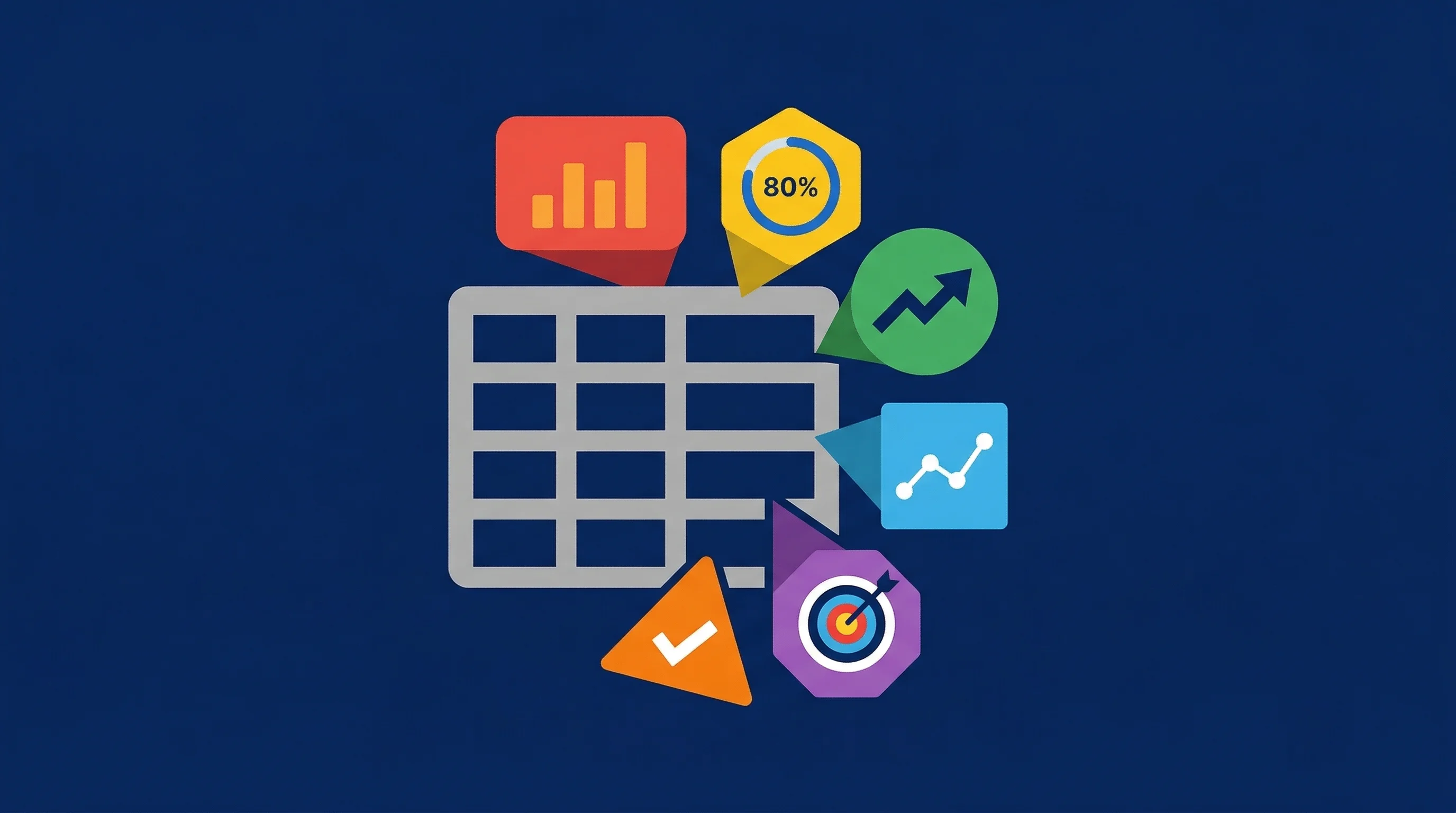
Six Dashboards, Six Perspectives
The brief was straightforward: give each team a dashboard that shows them exactly what they need, updated in real time, accessible from the same internal platform they already use. No spreadsheets. No manual exports. No "let me update the numbers before the meeting."
I built six dashboards, each designed for a specific operational role:
Front End Sales tracks pipeline metrics, deal velocity, conversion rates, and activity — calls made, meetings booked, tasks overdue. The sales lead opens it and sees exactly where every deal sits, how fast they're moving, and whether targets are being hit.
Broker Dashboard covers the finance arm — applications lodged, settlements tracking, and ratio monitoring. Different team, different pipeline, different metrics, but the same principle: open it and know where you stand.
Credit Team focuses on research workload, completion rates, and processing velocity. This team's bottleneck was never visible before — they were quietly drowning in work that only showed up as a "pending" count in someone else's spreadsheet.
Acquisitions tracks property search briefs, acquisition velocity from "ready for acquisition" through to unconditional approval, and active pipeline status. The buyer's agent lives in this dashboard.
Agreement Signed is an accountability view — tracking deals that have reached a specific stage and monitoring progress from there. It exists because deals were stalling post-agreement and nobody had visibility into why.
KPI Targets is the admin layer. Managers set monthly and quarterly targets per dashboard, and every other dashboard pulls from these to show progress bars and achievement percentages. No code changes needed to adjust a target — it's all through a management interface.
Real-Time, Not "Updated Last Tuesday"
The technical decision that made the biggest difference was also the simplest: skip the caching layer entirely and query the CRM API directly.
Most dashboard projects start with a database sync — pull data into a local store on a schedule, then query the local store. It's a reasonable pattern when API rate limits are tight. But this client's CRM plan had headroom: roughly 4% of their daily API allocation would cover everything. So instead of introducing sync jobs, failure handling, stale data risks, and all the maintenance that comes with a caching layer, I built the dashboards to fetch live data on every request.
Each dashboard polls every 60 seconds using React Query's smart polling — it pauses when the browser tab isn't visible, refetches on focus, and maintains a 10-second stale window. The result is that when someone opens a dashboard, the data is never more than a minute old. When they switch back to the tab after a meeting, it refreshes immediately.
The same Salesforce State of Sales report found that 51% of sales leaders using AI agree that disconnected systems are slowing down their initiatives (Salesforce, 2026 State of Sales, n=4,050). The word "disconnected" is doing a lot of work in that stat. It's not about systems being incompatible — it's about data living in one place and decisions being made somewhere else. A spreadsheet exported on Monday and discussed on Friday is a disconnected system, even if the CRM it came from is perfectly functional.
The Widget That Changed the Meeting
The single feature that got the strongest reaction wasn't a chart or a velocity metric. It was the KPI target progress widget.
Each dashboard has a section that shows current month-to-date numbers against targets — agreements signed vs. budget, deals closed vs. goal, discovery meetings booked vs. target. Simple progress bars with percentages.
Before this existed, the monthly exec meeting included a segment where someone would verbally report these numbers. "We've signed three agreements this month against a target of five." It was accurate, but it required trust — trust that the person did the count correctly, trust that the definition of "signed" matched everyone's understanding, trust that the number hadn't changed since they last checked.
Now they pull up the dashboard. The number is live. Everyone sees the same thing. The conversation shifts from "what are the numbers?" to "why are the numbers what they are?" and "what do we do about it?" That's a fundamentally different meeting.
Under the Hood
The architecture is deliberately simple. Next.js App Router handles the page structure. Each dashboard is a server-rendered page that loads a client-side content component. The content components use custom React Query hooks that call internal API routes, which in turn call the HubSpot API.
The widget system follows a consistent pattern: each widget is a self-contained component that manages its own data fetching, loading states, and error handling. A pipeline counts widget fetches deal counts by stage. A velocity widget calculates average days between stage transitions. An activity summary widget pulls calls, meetings, and tasks for the current period.
Access control is server-side — every API route checks the user's role before returning data. Only staff see dashboards. Only admins can edit KPI targets.
The KPI target system uses two database models: one maps a dashboard to a CRM owner (so when staff change, you update one record instead of rebuilding queries), and another stores the actual targets with period granularity — weekly, monthly, or quarterly. The admin interface lets managers adjust targets without touching code, which matters because targets change more often than anyone expects.
By the Numbers
The system replaced what would have required a dedicated reporting coordinator manually pulling CRM data, building Excel reports for each team, and preparing materials for executive meetings — a role averaging around $63,000 AUD annually in Australia (PayScale, 2026). It also reduced the ongoing need for data analyst hours spent on ad-hoc report requests and KPI tracking — roughly 0.3 FTE of a $95,000 AUD role (SEEK, 2026).
- 160 dev hours avoided compared to traditional agency delivery for six dashboards, 20+ widgets, API integration, KPI management, and role-based auth
- 1.3 FTEs replaced or reduced — one reporting coordinator plus partial data analyst workload
- ~$91,500 AUD in annual savings from operational roles no longer needed for manual reporting
- 6 dashboards serving 4 distinct teams with real-time CRM data
The savings are real, but the outcome that actually matters is harder to quantify: executive meetings that start with shared context instead of shared confusion. When everyone in the room is looking at the same live data, the conversation changes. You stop debating what the numbers are and start deciding what to do about them.
The Takeaway
Your CRM probably has the data your team needs. The gap isn't in the platform — it's in the last mile between stored data and shared understanding.
Spreadsheets fill that gap by default because they're flexible and familiar. But they introduce a hidden cost: someone has to build them, someone has to maintain them, and everyone else has to trust that the person who built them got it right. That trust erodes every time a formula breaks, a column shifts, or a number doesn't match what someone else pulled from the same source.
Custom dashboards aren't about replacing spreadsheets with something flashier. They're about removing the human bottleneck between where data lives and where decisions get made. When the data updates itself, when every team sees their own view, and when targets are tracked automatically — the spreadsheet tax disappears. And the meetings get a lot shorter.