Building a Digital Home for Disability Support — The Cynosure Platform
Some projects come to us with spreadsheets full of requirements, stakeholder maps, and integration diagrams. This one came with a conversation. A family of healthcare professionals — backgrounds in intensive care, emergency departments, and community-based support — were launching a disability support services company in NSW. They had decades of clinical experience between them. What they didn't have was a digital presence.
The brief was deceptively simple: build a website for cynosureservices.com.au that feels professional, warm, and trustworthy. Something that represents who they are — not a template that could belong to any provider in the country. And underneath that, they needed real tools: a blog they could manage themselves, a careers page for hiring support workers, a contact system that actually follows up, and an admin dashboard to run it all without calling a developer every time something needs updating.
Standing Out in a Crowded Space
The NDIS provider landscape in Australia is enormous. The industry is valued at $45 billion in 2026, with over 21,700 businesses operating in the space according to IBISWorld. But here's the number that really puts it in perspective: as of Q1 2025-26, there are 17,374 registered providers alongside 257,318 unregistered providers, according to the NDIA's quarterly report. That's a lot of providers competing for attention.
Cynosure operates as an unregistered provider, which means they work with self-managed and plan-managed NDIS participants. It's a deliberate choice — less bureaucratic overhead, more flexibility in how they deliver care. But it also means they need to earn trust quickly. When a potential participant or their family lands on your website, you've got seconds to communicate that you're legitimate, experienced, and genuinely care. A Wix template with stock photos doesn't cut it.
The Stack Behind the Care
We built the platform on Next.js 14 with the App Router, React 18, TypeScript, and Tailwind CSS. The backend runs on Supabase — PostgreSQL for the database, Supabase Auth for admin authentication, and Row-Level Security for data protection. Emails go through Resend with React Email templates, and the whole thing deploys to Vercel.
The component library uses shadcn/ui for the admin interface, while the public-facing pages are fully custom. Animations run through Framer Motion with Studio Freight's Lenis for buttery smooth scrolling. Forms use React Hook Form with Zod validation. State management is handled by Zustand where client-side stores are needed.
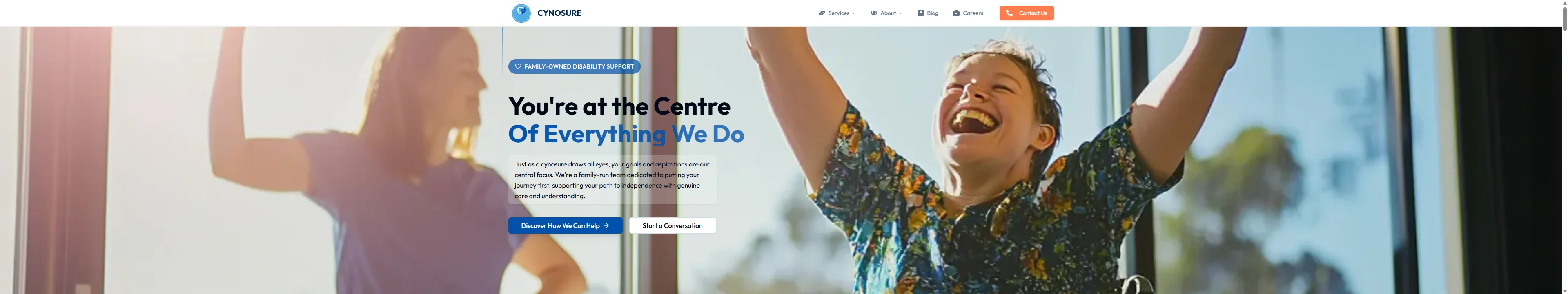
It's a serious stack for what might look like "just a website." But that's the point — the technology should be invisible. Visitors don't see the stack. They see a hero section with a joyful kid raising his arms in triumph, a warm tagline that says "You're at the Centre of Everything We Do," and trust indicators showing 40+ years of combined experience. The engineering serves the emotion.
A CMS That Actually Gets Used
One of the biggest risks with custom platforms is building an admin panel so complex that the client never touches it. We've seen it happen — beautiful dashboards that collect dust because they're intimidating to use.
For Cynosure, the admin dashboard is deliberately focused. It does four things well:
Blog management with a full Tiptap rich text editor. The team can write posts, add images and links, manage tags, save drafts, publish, or archive. Tags are created on the fly and reused across posts. Slugs auto-generate from titles. It's the kind of CMS that a non-technical person can pick up in five minutes.
Job listings with structured fields for location, salary range, job type, experience level, department, and whether NDIS experience is required. In a sector with chronic workforce shortages — with nearly half of providers reporting financial losses according to the National Disability Services State of the Disability Sector Report — having a polished, easy-to-update careers page isn't a nice-to-have. It's a recruitment tool.
Contact and feedback forms that don't just collect submissions. When someone fills out the contact form, two things happen simultaneously: the team gets a notification email with every detail, and the person who submitted gets a confirmation email letting them know their message was received. It's a small touch, but it signals professionalism. The system tracks submission status, email delivery, and any errors — all visible in the admin panel.
Dashboard stats that give the team a quick pulse: how many blog posts are published, how many jobs are active, how many drafts are sitting in the queue. No analytics overwhelm, just the numbers that matter for content operations.
Making It Feel Human
This is where the project got genuinely fun. Disability support is an industry where warmth and trust matter more than almost anything else. The design needed to feel human without being saccharine, professional without being cold.
The hero section uses a parallax zoom effect with Lenis smooth scrolling — the background image scales gently as you scroll, creating a cinematic feel that draws you into the page. The headline animates in with staggered timing, and the trust indicators count up from zero with spring physics. There's even a set of decorative gradient accent lines that slide in to frame the content.
The "Why Choose Us" section runs on an Embla carousel — six feature cards with background images and hover states that cycle through on desktop with keyboard and touch support on mobile. The process section uses an alternating timeline layout (left-right-left on desktop, stacked on mobile) with scroll-triggered animations that reveal each step as you reach it.
And yes, there's confetti. When someone successfully submits a contact form, canvas confetti fires off in a celebration burst. It's a tiny detail. But in a space where people are often navigating stressful decisions about care for themselves or their loved ones, a moment of unexpected delight goes a long way.
Every animation uses Framer Motion's will-change CSS optimisations, and the scroll triggers are debounced to keep performance smooth. The hero image loads with priority, and the site scores well on Core Web Vitals despite the animation density.
By the Numbers
Building Cynosure as a custom platform rather than going through an agency or cobbling together WordPress plugins delivered measurable value:
- ~250 development hours avoided compared to a traditional agency build with similar scope (CMS, careers, blog, contact, admin, automated emails)
- 1.5 FTEs replaced — the platform eliminates the need for an ongoing agency retainer ($70K AUD) and a part-time content/marketing coordinator ($55K AUD) who would otherwise manage blog updates, job postings, and form submissions manually
- $125,000 in estimated annual savings from operational self-sufficiency
- Automation type: Full-stack — content management, recruitment, contact workflows, and email automation all unified in one platform
The team runs the entire digital operation themselves now. Blog posts go live without a developer. Job listings update in minutes. Contact submissions get responded to automatically. That's the real win — independence.
The Tech Should Disappear
There's a phrase we keep coming back to on projects like this: the best technology is the kind nobody notices. A parent researching disability support for their child shouldn't be thinking about your tech stack. They should be feeling reassured. They should be thinking, "These people understand. These people care."
Everything we built for Cynosure — the parallax hero, the smooth scrolling, the auto-emails, the blog CMS, the careers board — exists to support that single moment of trust. The engineering is rigorous. The animations are polished. The admin tools are comprehensive. But none of that matters if the person on the other end doesn't feel seen.
That's the project we're proudest of here. Not the code. The feeling.